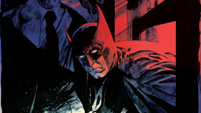
SYNOPSIS: The year is 1939. The world, still reeling from the horrors of the First World War, is on the brink of tipping into an even more gruesome conflict, as fascism is on the march — and gathering strength in America’s darkest corners. Against this backdrop, a series of violent murders has begun in Gotham, and the recent emergence of the mysterious vigilante known as The Bat-Man has the power brokers of the city living in fear of institutional collapse. All of the evidence in the murder investigation defies logic: the perpetrators are all men who died in the electric chair. But when The Bat-Man comes face to face with one of these sickening anomalies, he barely escapes with his life — throwing into question his ability to survive in a world that is brutally evolving around him! Legendary writer Dan Jurgens and superstar artist Mike Perkins return to the earliest days of The Dark Knight, retelling one of his most infamous cases through an acutely modern lens, depicting a world paralyzed by anxiety and a desperate populace crying out for release!
If you’ve been following Batman comics recently, it will come as no surprise to hear that another Black Label book is outstanding. The art is fantastic, the story is engaging, and the historical setting allows familiar Batman elements to shine in unique ways. We’ve seen Batman in different settings before, most notably in Gotham by Gaslight. First Knight offers a different kind of twist though, the historical setting serves a thematic role as well as being a plot device. The social problems of 1939 Gotham are part of the story here, but they also set the stage for the characters to show us who they really are at their core. Between this and books like Riddler: Year One and Batman: Imposter, it seems Black Label books have more thematic depth than their mainline counterparts. Maybe that’s too broad a conclusion to draw, but that’s at least how it seems.
Like I said, the 1939 setting is used especially well. Gotham has always had problems in Batman stories, but tying those problems to real historical events gives them a gravity that sets a distinct tone. It’s one thing to tell a Batman story with pollical unrest in Gotham, it’s another to show actual Nazi rallies taking place. Classic mafia elements are featured as well, with one murder scene near the beginning that looks pulled right out of the Godfather trilogy or Goodfellas (pay attention to the meal selection). There are other noir elements here too: a puzzling and grisly murder case, a femme fatale who holds vital information, good guys trying to work within a corrupt system while having their own baggage, everything you’d expect to find in film noir classics is put to work in this book. Batman makes some significant progress on solving the mystery, but what he discovers is a bit of a twist, and I’ll be interested to see how far they push the boundaries the story appears to be setting (can’t say too much without spoiling it).
This book is excellent. The art style is a particular highlight. Mike Perkins and Mike Spencer have done a great job giving the book a realistic painted look. Overall, the art style is like a cross between Lee Bermejo and Brian Bolland, two of my favorites. Gotham’s dark muted colors show a city falling apart, while bright vibrant colors are used in action scenes and some other important character moments.
A couple of other fun observations: the movie marquee prominently advertises Mr. Smith Goes to Washington, a movie about a guy who does the right thing even in a hopeless situation. I think Batman can relate, and it’s little things like this that clue you in on the theme of the book. Also, Batman is rescued by and befriends a Rabbi. Batman has, as far as I know, been portrayed as both an atheist and Episcopalian before, but I’m curious to see how this relationship develops. For most of their history, the Jewish people have known tragedy and Bruce can certainly relate to that, but they were especially in danger in 1939 so I’ll be looking to see how that develops.
Does the book have any flaws? I don’t know if I’d call them flaws, but not everything worked for me. The wide-set ears on Batman’s mask are clearly an homage to his early appearances, but in an otherwise beautifully realistic art style, they look kind of goofy. And I know giving Batman white eyes is another traditional choice in the comics, but I couldn’t help wishing I could see more of his expressions here. He’s still early in his career, so he’s not yet the stone-faced stoic we’re used to. He trash talks, he gets hurt, and he has emotional moments. He’s a bit more expressive, and I wouldn’t mind seeing that. However, I do love the shade of midnight blue they use for his suit. I’ve always preferred a dark shade of blue to plain black, and this just about gets there. There are other interesting choices made with colors on his suit, but I’ll let you read the issue and see that for yourselves.
Bottom line, this is another standout Black Label Batman book that looks to be headed in a great direction. Can’t wait to see what happens next. – Trey Jackson

