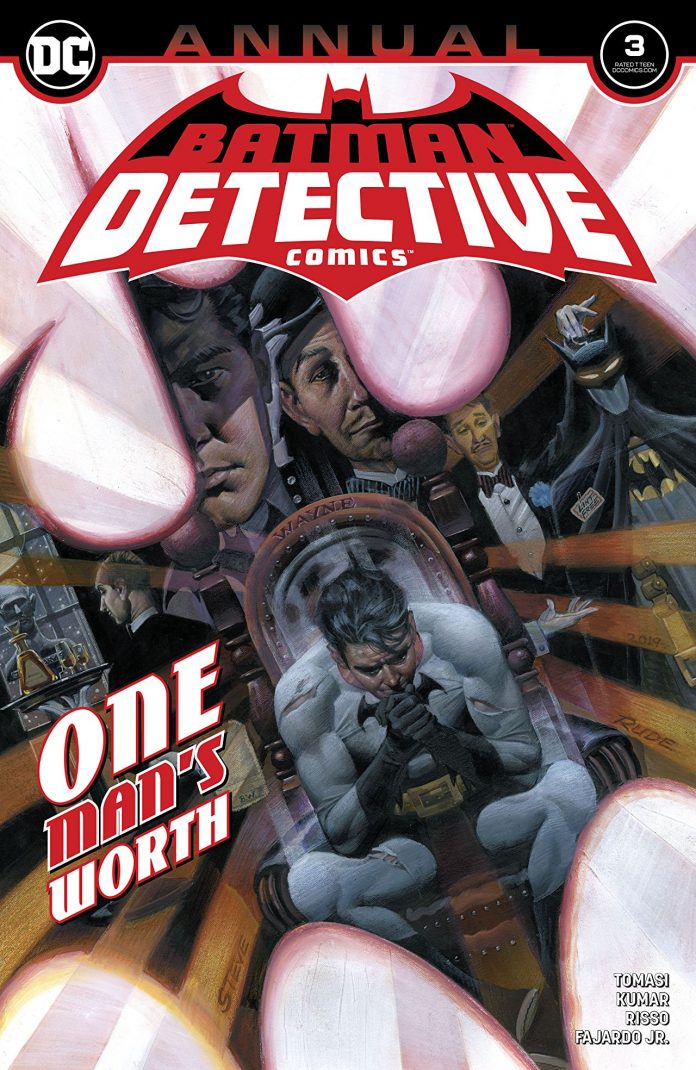
SYNOPSIS: Of all the mayhem and madness that “City of Bane” visited upon Batman’s world, the death of Alfred Pennyworth had the greatest impact. As Bruce struggles to pick up the pieces of his life, the absence of the man who had always helped him is felt with devastating consequences. With new storm clouds brewing on the horizon, does Bruce Wayne have what it takes to honor his dearest friend’s memory?
If the last two issues of Detective Comics fell flat for you then get ready because Mr. Tomasi has bounced back rather quickly.
Detective Comics Annual #3 is thirty-nine pages and two stories dedicated to the greatest butler in fiction. The first story “Who Dares, Wins” is a wonderful tale that is the perfect mix of Bond meets Batman. While the second “The Week” is a lovely rehashing of Bruce’s earliest days under the cowl.
Since Alfred has passed Tomasi has shown glimpses of what Bruce has become following the loss. In “Who Dares, Wins” we really get a sense of how far Bruce but not Batman has fallen. The Batman is still our hero, saving the day, but now the cave is a mess, the fridge is empty. All the little things that Bruce has taken for granted through the years have crept up on him. When Alfred’s past breaks into Wayne Manor in need of help and nowhere to go; we see our Dark Knight spring into action. Batman goes international in order to honor his fallen friend and does so in splendid fashion. An unlikely team-up, an adversary that should be dead, sprinkled with some detective work and action there is more than enough awesome sauce for any Batfan to sink their teeth into!
Sumit Kumar is our artist on “Who Dares, Wins” and I totally dig this style of artwork. For the first time in a long time, I felt like I was looking at actual pencils and not a digital rendering. The artwork has that old school feel to it, even as I read this on my MAC it gives off that old paper vibe. The lines are thin and sharp but have an edge to them. I might have to say this is my favorite drawn book of 2020 so far. Kumar drew the hell out of this book, the use of lens flairs alone is enough to bring a grin to any cinephile’s face. Batman’s cape has never looked better. From jumping out of a burning building to gliding on top of a car. Hell, just seeing it blow in the wind is beautiful. Kumar has a tremendous touch for panel placement. Each panel flows into the next, all different sizes and shapes overlapping on top of splash pages. At times you get a picture in picture feel to the placement and that really adds character to this story. Kumar can really sell emotion from a character’s eyes. Regardless of Batman or Bruce when Kumar gets up close and personal you don’t need any description to read the emotion pouring off the page.
I want to throw a quick shout out to colorist Romulo Fajardo Jr. Fantastic job here, the flashback pages feel have that throwback motion picture look and I can’t get enough of the balance of warm and cool colors. The panels where the Batmobile drives into the cave to where Bruce sits down eating his apple is one of the most beautifully colored sequences ever. Blue, orange, red and lavender all working wonderfully hand in hand. If you can’t get David Baron to color your book, I’m pretty sure Fajardo is the right person for the job.
Tomasi’s second tale “The Week” is a real fun pen-pal type story. We get a firsthand look at the beginning of The Batman through the eyes of the person who was there from the start. These stories are always a joy to me. So often do we see tales like this from Batman/Bruce’s point of view that when we get to see Alfred’s it really is something to behold. While this is much shorter than the first part of the annual it is not any less fun, it’s just a different style. Alfred tells the story as only he can with that famous dry wit. Knowing full well that he has to be subtle in his writing, you would have to be MI6 to read between these lines.
The artwork in “The Week” has a totally different look to it. Eduardo Risso is our artist and I feel his work is a hybrid between Paul Pope and Martin Marazzo. Risso has that gritty look that Pope had in Batman: Year 100 while mixing in that slender character look that Marazzo has been delivering with Image Comics Ice Cream Man, it’s a very interesting style. Risso also is the colorist for the story and this is where I think he shines. At times the pages are dominated by one tone or filter then there are pages that are mixed and match. A green page with hints of red or a blue page with yellow and a hint of red. It is such an interesting take; I have never seen anything like it, and I appreciate that.
Detective Annual #3 is a must-have for your pull list this week. One writer, two artists and thirty-nine pages that you will love from cover to cover. While the last arc in Detective really left some of us scratching our heads this one will leave you with a sense of enjoyment that we are accustomed to when we pick up a Tomasi book. Who knows how long Alfred will be gone for but stories like these really lessen the blow of a gimmick that we are all tired of seeing. – Peter Verra

